Upgrade System

Role: Lead UX/Visual Designer
Summary
This project was focused on creating a cohesive and scalable design system for premium features that are used across the Squarespace ecosystem.
Problem
The previous design system only covered 1/3 of the touch points for premium features and had disjointed messaging across various products. The team received internal and customer feedback that "upgrade pill" (see below) obstructed customer's work and did not accurately communicate how the trial period worked.
Version 1 of the design system "upgrade pill" in a panel.
Process
I started by doing a heuristic evaluation of the current system and gathered product requirements from the 4 PM's who had premium features in their product. Next, I created a map of all the double gating scenarios (where a whole panel is marked as available on a business or commerce plan, but one feature within that panel is only available on a commerce plan). Once I had all the touch points confirmed withe the PM's, I started doing research on iconography and color. My requirements for a color to be considered were that it be accessible, look/feel premium, and not feel out of place with the brand. I wanted the system to feel like a sub brand within the Squarespace brand, and it had to be scalable across a multitude of placements/sizes. Because customers could add and edit some premium features before upgrading their plan, each element of the system needed to be informative but not block or distract from the editing experience.
Early color exploration
Early icon exploration


Early placement exploration on contextual menus
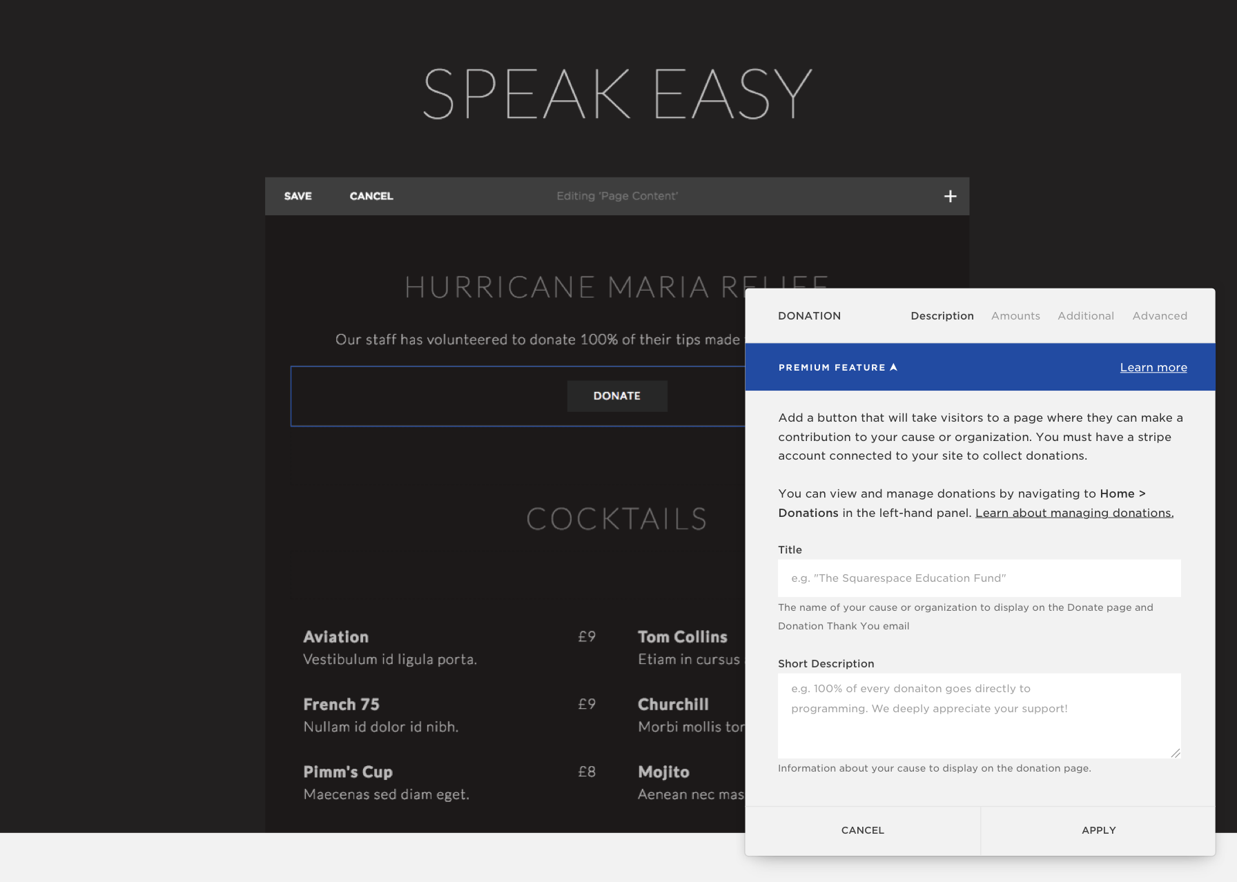
Solution
I created a smaller more scalable design system that works across multiple instances in the product. I also set the interaction rules and guidelines so that if you have multiple instances of premium features on a page, the messaging doesn't overlap. In addition, I clarified upgrade messaging so customers understand premium features won’t show up on their live sites until they upgrade. Each “learn more” modal would be customized per feature and include a list of other premium features based on data we had about feature grouping on sites.
Learnings
When adding an element to the page, I originally grouped all the premium features in their own section with the icon. If I could go back, I would move each element to it’s contextual place in the menu and give each one an individual marker that it was premium. While it’s easier for eng and product to have all the premium features grouped in one place, it actually makes it more difficult for the user to find what they are looking for. Users don’t know which features are premium until we tell them. If they are looking to add a donation block to their page, the user would look for it naturally in the commerce section not the premium section. Keeping the features grouped as families would help reduce friction in the editing process.