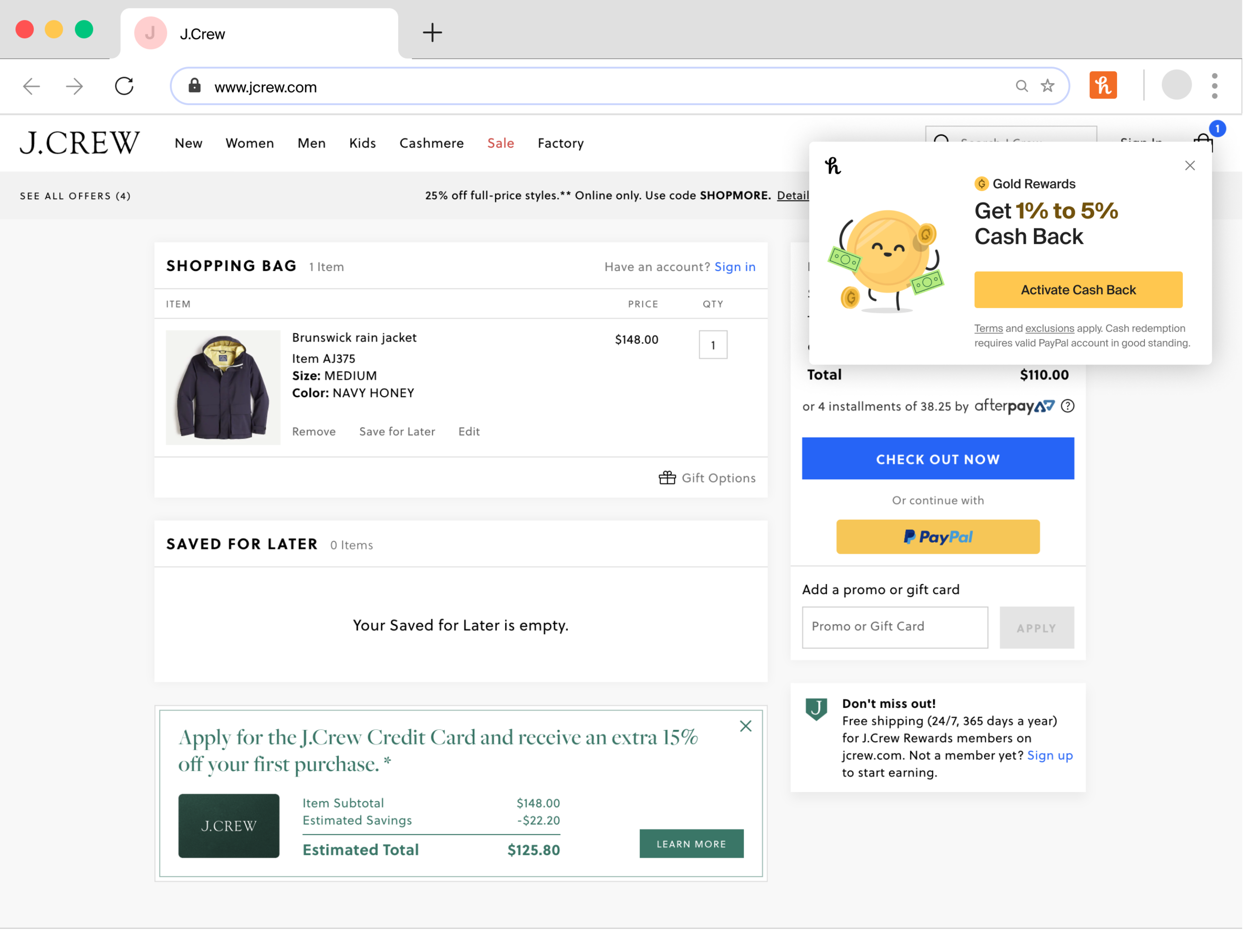
Cash Back

Role: Lead Product Designer
Background Context
Honey started as a browser extension to provide value at the bottom of the funnel shopping experience by mitigating cart abandonment. To do this, Honey’s initial product was a coupon finder that would automatically apply savings for users in the check out flow. Honey also had a rewards program called “Honey Gold” where users would earn “Honey Gold” while they shopped. The goal of the program was to still provide value (and some form of savings) to the user even when Honey couldn’t find active coupons. Users could earn Honey Gold by activating specific product offers, or just from shopping at certain merchants. Once users earned 1,000 Honey Gold, they could redeem for a $10 gift card.
Summary
I joined in 2020 and lead Honey's Savings and Rewards design team. I was responsible for all of the experiences delivered through Honey's web browser extension and mobile web extension. For 9 months in 2020 - 2021, I redesigned rewards from the ground up, including a revamp of the system design and the rewards redemption process to PayPal.
Problem
Lack of clarity and awareness around Honey’s rewards program (Honey Gold) was hurting merchant conversion rates for users in checkout. Users were less likely to check out when they earned Honey Gold than when they earned nothing at all.
Existing Honey Gold Flow
The first interaction a user has with Honey Gold is through store tips. We show them the average savings at the store, the Honey Gold range, and prompt them to activate rewards. The problem here is that we never tell the user what the rewards are (cash? points? gift cards? valueless marketing tools?). In the offers section below the CTA, we then introduce a G icon that has seemingly no connection to the rewards content above. Again, we don’t tell the user what they are interacting with. For all they know the “G1,500” could be the price of the item.

The next opportunity the user has to interact with Honey Gold is through an exclusive offer on a product detail page. This is the first time the user can see that Honey Gold might have a monetary value. Although it’s still unclear what you can use your Honey Gold for or how you would use it.
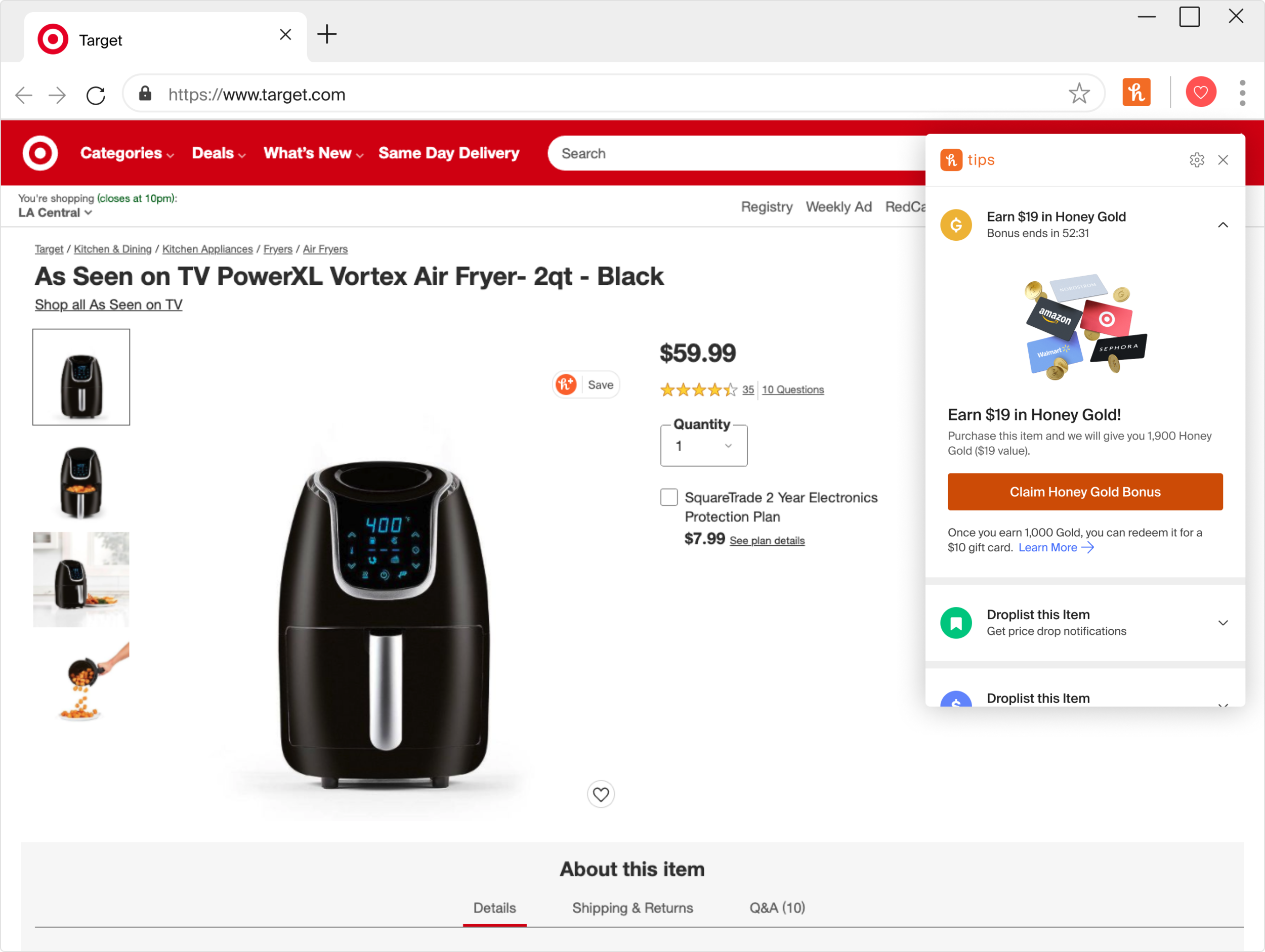
The final place the user interacts with Honey Gold in their shopping journey is during the find savings flow (screenshots below). In the second screenshot below, the user sees that there are no active coupons for their order but they are earning “Gold” on this purchase. This is the first time we refer to the currency as Gold and it is the last step of the shopping flow. At this point, users are less likely to check out if they are earning Honey Gold than if they are earning or saving nothing at all. That’s a crazy data point, but also not shocking because the user still doesn’t know what Honey Gold is or how it’s relevant to them.


The two screenshots below are how the user would see their activity in the Honey app. A common quote from users at the time was “Oh yeah, I’ve heard of Honey Gold, I know I’m getting it I just don’t know what it is.”


Process
I set up a modified design sprint with the goal to understand what we currently knew about Honey Gold: how users perceived it, the ways it was currently underperforming, where it showed up in our products, and how PayPal planned to leverage it. This cross functional group included stakeholders from product, content, marketing, and legal.
That was a lot of design speak, I can see your eyes rolling as I type this. As with most design sprints, a lot of the “life changing” ideas got deprioritized. But, there were some major themes that we all agreed needed more exploration.
We needed to introduce more value higher up in the funnel with rewards
The way we presented the existing Gold program was different on every single surface
When a user shops with Honey, they should know they are earning cash back, when the cash back will be available, and how to redeem
We needed a consistent design system
The design system needed to be flexible enough that PayPal designers could also use it
How could we use rewards to encourage repeat shopping
After the design sprint, I spent months working with leadership to get alignment from both PayPal and Honey on branding for the program.
Solution
I pitched a design lead innovation track. I received buy-in from design and product leadership to form a new team (Savings and Rewards) focused on rewards while still delivering on my quarterly roadmap. Product and I partnered and created a cash back program called “Gold Rewards” where users earn “Gold points” (shorthand: points). The purpose was simple: shop with Honey, earn points, and redeem for cash. We had to update a lot of how the back end of the program worked by working with legal and finance to shorten vesting timeframes for points, as well as removing redemption thresholds across all markets, and adding a cash redemption option via the user's PayPal account. I created a rewards design system, and set up weekly office hours so that designers could bring their designs in to be workshopped or just ask general questions about how we should be presenting Cash Back on their surfaces.
Honey launched the Gold Rewards Cash Back program in August 2021 and immediately saw an increase in conversion rates at checkout and higher redemption rates. Specific metrics can be found below.
New Gold Branding Components
I designed an accessible logo (left) and text component (right) that could scale to different breakpoints and surface sizes. Examples of how the system scales are below.

JoinHoney.com


iOS explore page and product detail page


Tips Before
Tips After


Tips Variant - Only Cash Back

Product Detail Page
I simplified the design, added consistent terms and conditions, and made sure it was visually consistent with the rest of the system. In the second screenshot below, I added additional text to the activated state to tell the user where and when they could redeem.


Variants we tested for Find Savings


Final Find Savings Design

I also pushed to create an entirely new experience for post purchase to address some of the comprehension issues we had from the original brand. In post purchase, the stakes are lower, the user has already completed their purchase, reminding them they earned Cash Back on that purchase creates a moment of delight and lets us educate them on where to view their balance and redeem.
Post Purchase

Post Purchase Email Flow
A new email that users would received after their purchase clearly showing how much their points were worth as well as where and when they could redeem them.

Working with legal
I worked really hard with the legal team to make sure that we had consistent terms and conditions across all different surfaces and view ports and included those with examples of how and when they should be used in the design system. At the time it was common for design to be blocked by legal for up to two months, adding the terms and conditions to the system shortened this timeframe to days. I also had to push really REALLY hard to get the terms and conditions to be the shortest they could possibly be at every touch point, I knew that the more terms there were the more gimmicky the value prop would seem and the less likely the user would be to interact with Cash Back. To accomplish this, I read the FTC guidelines in their entirety and worked with legal to reach a compromise where we could cap the length of the T&C at two lines.
Legal updates - round 1

Legal updates - round 2

Legal updates - final
Metrics
In a prototype we tested before we launched an A/B test for Cash Back, 88% of users immediately understood and saw the value of Cash Back and points. In addition to this 75% of users were more likely to recommend Honey to their friends.
Post launch:
The new redemption flow sees over $1M redemptions to PayPal a month
2.17 million unique users found savings through offers on the product detail page (up 230% from last year).
Daily shopping sessions increased 15%, monthly shopping sessions increased 21%, and checkout conversion increased 30%.